18 Earthy Pink Bedroom Ideas Even Your Partner Will Approve

An earthy pink bedroom is a hard sell at first. Say the word “pink” to your partner and watch their face. They’re already picturing bubblegum walls, glitter pillows, and a 90s teenage bedroom with a beaded curtain.
But earthy pink is a totally different shade family. Think sun-baked terracotta, dusty rose plaster, dried florals, and warm desert clay, all with brown and yellow hiding underneath.
These tones act like a warm neutral. They flatter daylight, glow at sunset, and give a bedroom that calm boutique hotel feel. Before you buy paint or new bedding, watch how light moves through your room for a day and plan your layout, because these bedroom background ideas show how much one wall color changes everything.
Below are 18 earthy pink bedroom ideas getting saved like crazy on Pinterest and Instagram, each with a real way to pull it off.
The Anti-Dollhouse Undertone Rule
Hold every swatch next to a sheet of white paper. If you can see brown, gray, or warm ochre underneath, keep it. If it looks like cotton candy or cold magenta, toss it right away.
Keep these
Muddy, warm, slightly gray
Skip these
Bright, cool, candy-like
18 Earthy Pink Bedroom Ideas That Look Grown Up
1. Dusty Rose and Deep Sage Green
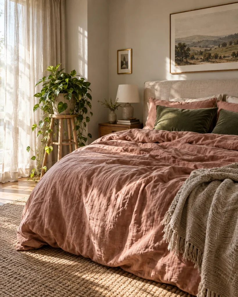
The Visual Vibe: Dusty rose walls with deep sage bedding feel like a quiet English garden. Soft, botanical, and very calming.
The Design Counterbalance: Green is pink’s natural opposite, so it instantly cools the sweetness. Add a few real plants to finish it.
The Real-World / Renter Hack: Keep your walls and bring in sage sheets with one dusty rose throw. You get the whole look with zero paint.
2. Sunbaked Terracotta-Blush Limewash
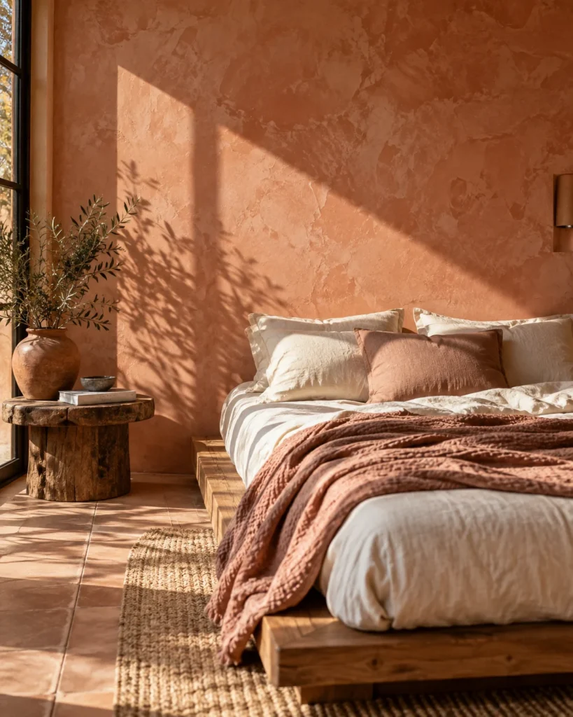
The Visual Vibe: Cloudy, chalky limewash in terracotta blush looks like old Mediterranean plaster. Direct sun hits it and turns soft instead of glaring.
The Design Counterbalance: The rough, uneven texture reads earthy and handmade, never sweet.
The Real-World / Renter Hack: Try limewash on one wall behind the bed first. It’s easy to repaint if you move.
3. Muted Mauve and Raw White Oak
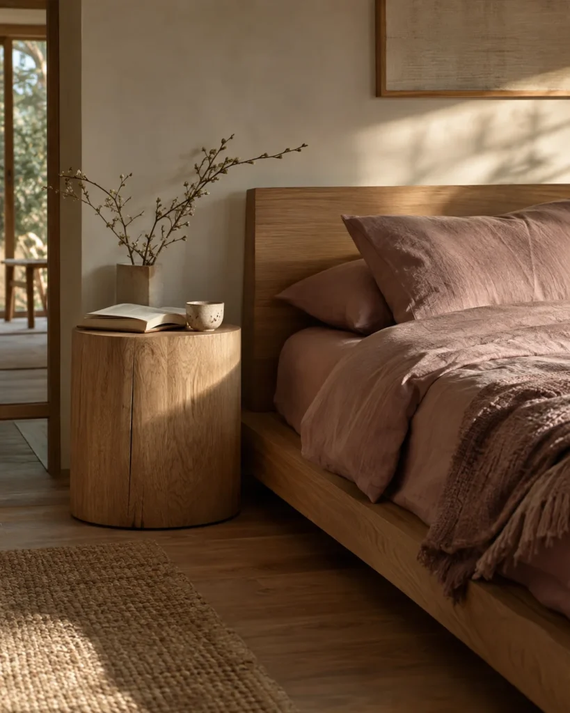
The Visual Vibe: Soft mauve walls with a low white oak platform bed give a calm Japandi mood.
The Design Counterbalance: Pale natural wood and very little decor keep the room clean and mature.
The Real-World / Renter Hack: Thrift a light wood nightstand and sand it raw. Skip the stain for that unfinished Scandi look.
4. Desert Sunset Palette: Blush, Ochre and Burnt Rust
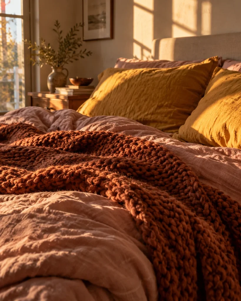
The Visual Vibe: Layered blush, ochre, and rust textiles feel like a warm evening in the desert.
The Design Counterbalance: Rust and ochre add depth and weight, so the pink feels warm, not girly.
The Real-World / Renter Hack: Start with three pillows, one in each color. Add a rust throw later if you love it.
5. Matte Black Iron and Moody Plum-Pink
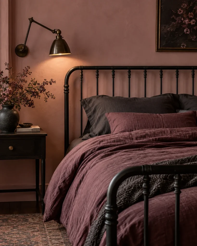
The Visual Vibe: Deep plum-pink walls with a black iron bed frame look dramatic and moody.
The Design Counterbalance: Matte black metal adds a strong architectural edge that grounds the softer color.
The Real-World / Renter Hack: Spray-paint old lamp bases or curtain rods matte black for an easy, cheap update.
6. Tone-on-Tone Clay Color Drenching
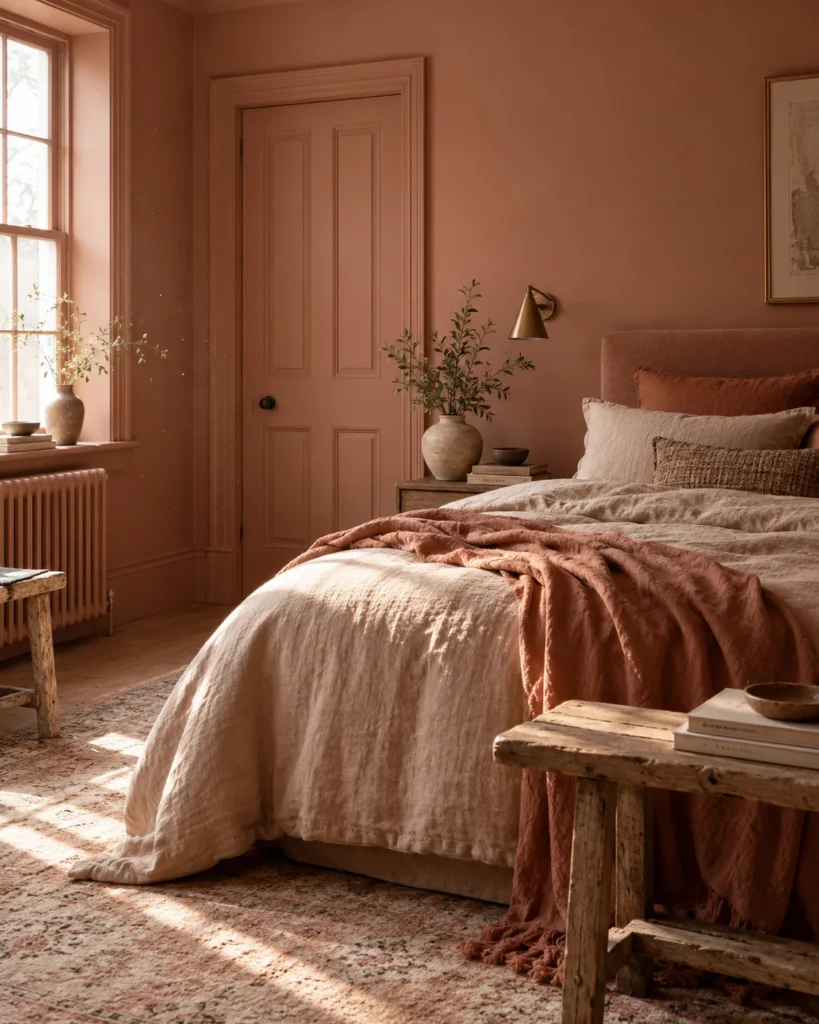
The Visual Vibe: Walls, trim, and baseboards all painted one matte clay color feel cocooning and modern.
The Design Counterbalance: One unbroken color looks intentional and high-end, like a designer did it.
The Real-World / Renter Hack: Shades like Setting Plaster and Dead Salmon from Farrow and Ball are classic clay pinks. Buy sample pots first and paint large boards to test.
Best Partners for Earthy Pink
Oatmeal
Walnut brown
Ochre
Matte black
Aged brass
Raw white oak
7. Arched Fluted Plaster Bedside Feature
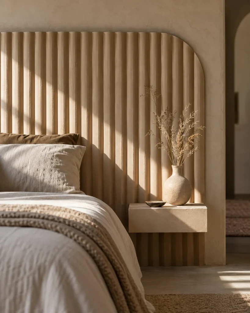
The Visual Vibe: A tall arched panel with vertical fluting behind the bed acts like a sculptural headboard.
The Design Counterbalance: The architectural lines feel structured and grown up, balancing the soft color.
The Real-World / Renter Hack: Flexible fluted panels can be cut and painted in clay pink, then mounted with removable strips.
8. Earthy Boho with Braided Jute and Rattan
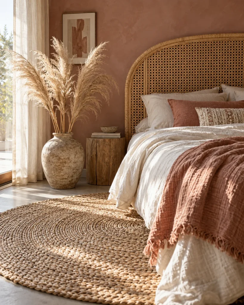
The Visual Vibe: A braided jute rug, rattan headboard, and blush bedding feel warm and laid back.
The Design Counterbalance: Natural woven fibers add rough texture that keeps blush from feeling precious.
The Real-World / Renter Hack: Woven baskets and rattan finds are easy to thrift. For more natural-material inspiration, these boho makeup vanity ideas pair beautifully with blush rooms.
9. Rumpled Washed Flax Linen Layers
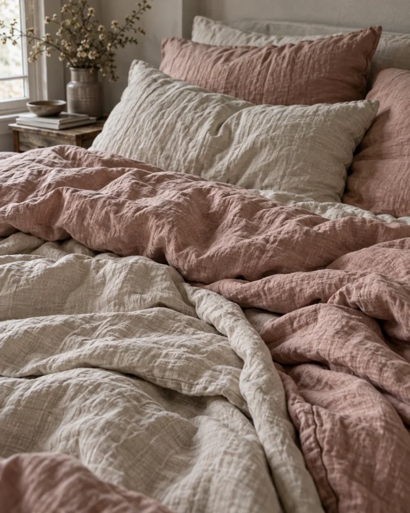
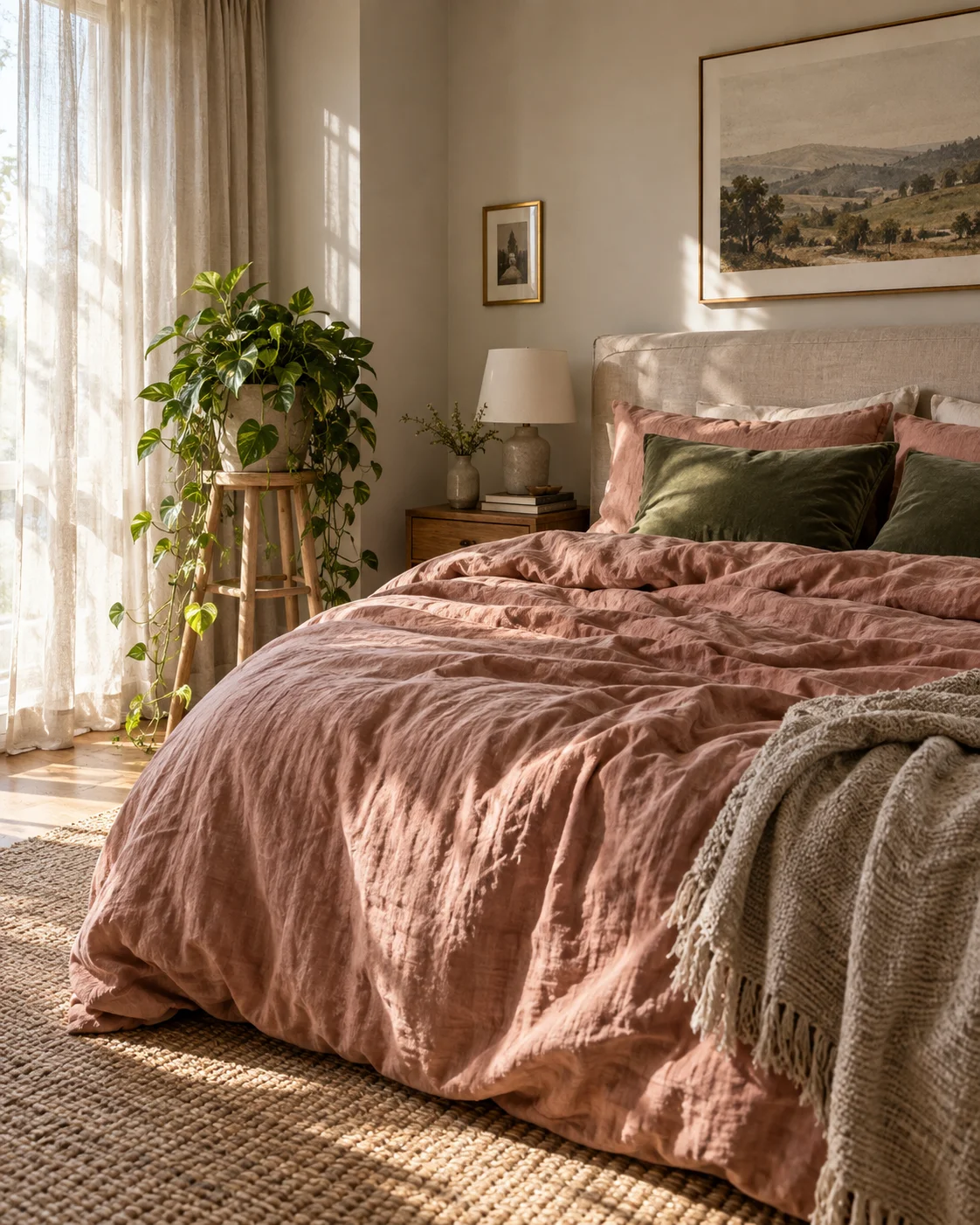
The Visual Vibe: Crinkled washed flax linen in soft clay looks effortless and lived in.
The Design Counterbalance: Matte, natural fabric avoids the cheap shine of synthetic pink sheets.
The Real-World / Renter Hack: Can’t afford a full set? Start with a linen duvet cover over your existing white sheets.
10. Honed Travertine and Dusty Rose Minimalist Corner
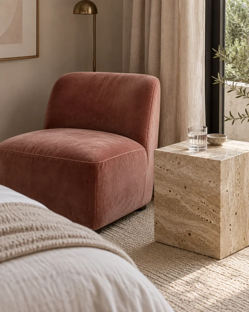
The Visual Vibe: A honed travertine side table next to a dusty rose velvet chair feels quietly luxurious.
The Design Counterbalance: Cool, pitted stone grounds warm velvet and adds a natural, earthy touch.
The Real-World / Renter Hack: A small travertine tray or lamp base gives the look for far less than a full stone table.
11. Subtle Dusty-Rose and Oatmeal Checkerboard Fleece
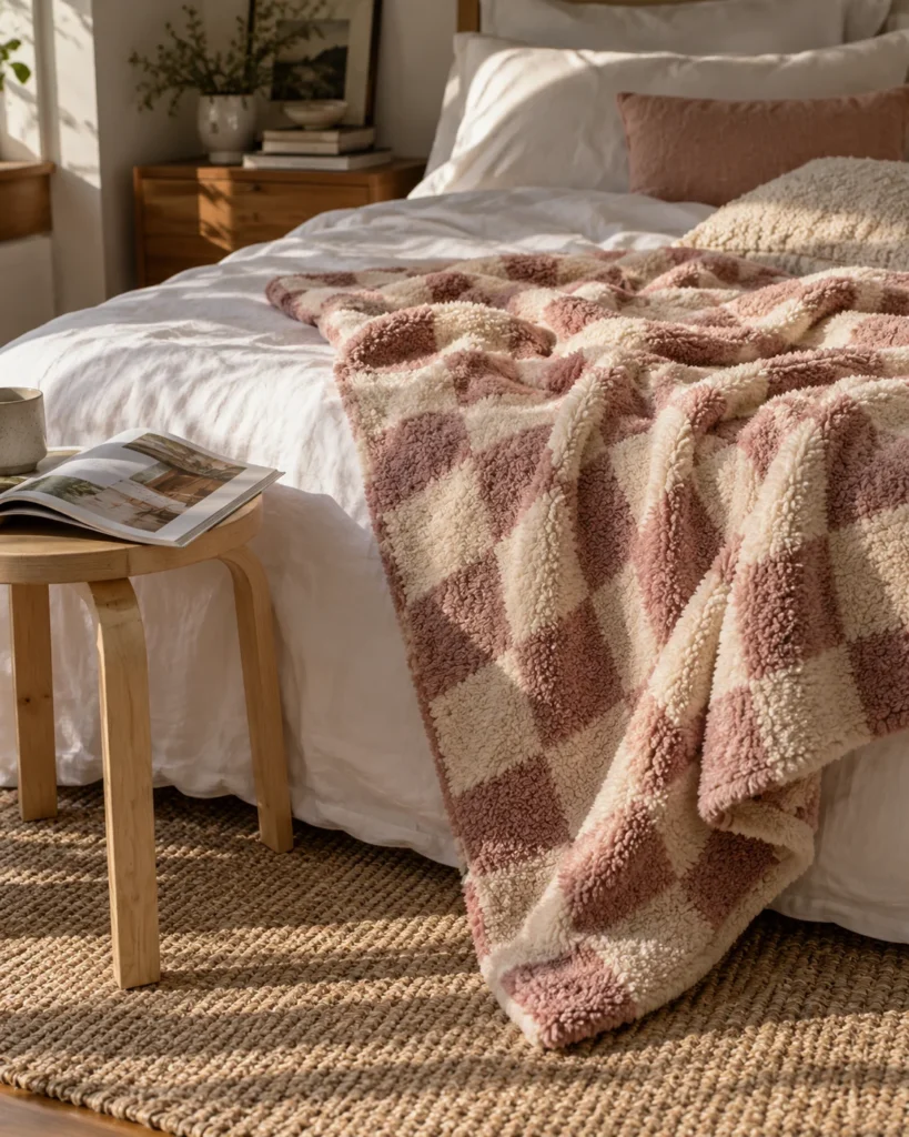
The Visual Vibe: A soft dusty rose and oatmeal check throw brings a playful Y2K wink.
The Design Counterbalance: Muted colors keep the trendy pattern calm, not loud.
The Real-World / Renter Hack: Use the pattern on one piece only, like a throw or a single pillow.
12. Faded Indian Block-Print Floral Quilts
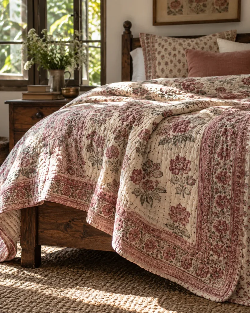
The Visual Vibe: Hand-stamped floral quilts on unbleached cotton feel artisanal and heirloom.
The Design Counterbalance: The slightly uneven, faded print feels collected and well traveled.
The Real-World / Renter Hack: Wash new block-print quilts in cold water a few times to soften colors and fabric.
Earthy Pink: Do This, Not That
| Do This | Not That |
|---|---|
| Matte or flat wall finishes | Glossy pink paint |
| Linen, jute, boucle, and stone | Satin, faux fur, and glitter |
| Brown or gray undertone swatches | Cool candy pinks |
| Walnut, black, or brass contrast | White everything with pink |
13. The Blushing Fifth Wall Ceiling Glow
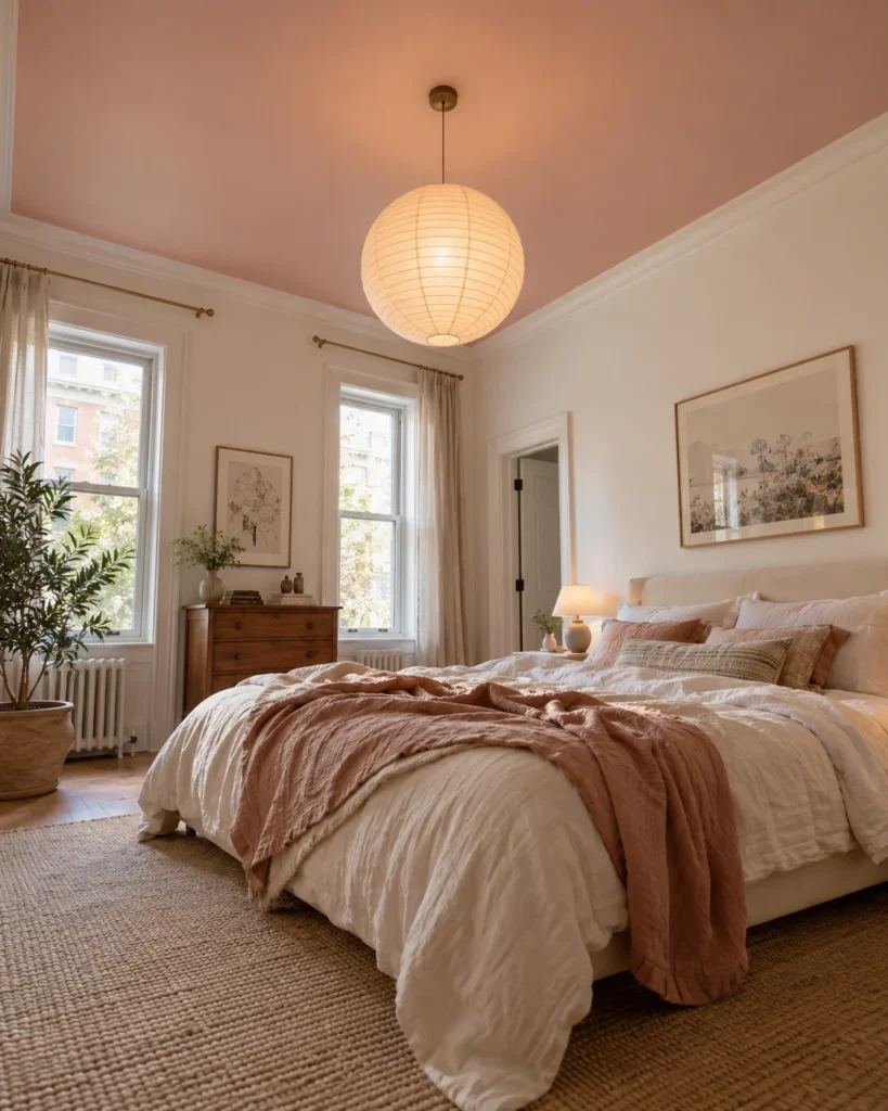
The Visual Vibe: Neutral walls with a soft peach-pink ceiling bathe the room in a gentle glow.
The Design Counterbalance: Keeping walls neutral makes the pink feel subtle and sophisticated.
The Real-World / Renter Hack: Choose a shade lighter than you think, because ceilings always look deeper once painted.
14. Aged Brass Hardware and Ribbed Glass Lighting
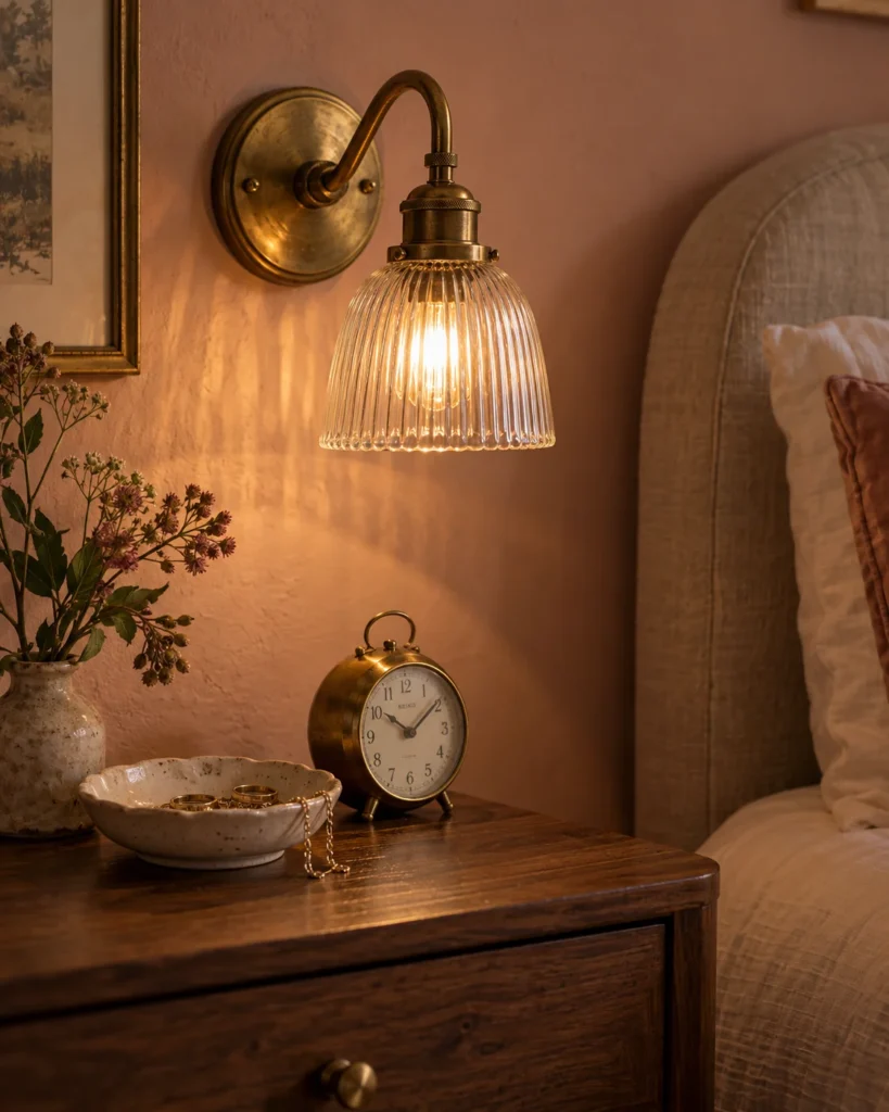
The Visual Vibe: Aged brass knobs and ribbed glass sconces add vintage sparkle to matte walls.
The Design Counterbalance: Warm metal adds a grown-up, boutique hotel finish.
The Real-World / Renter Hack: Swap dresser knobs and keep the old ones to reinstall later. These vanity lighting over mirror ideas show how warm sconces flatter pink walls.
15. Dark Espresso Walnut and Powder Blush Contrast
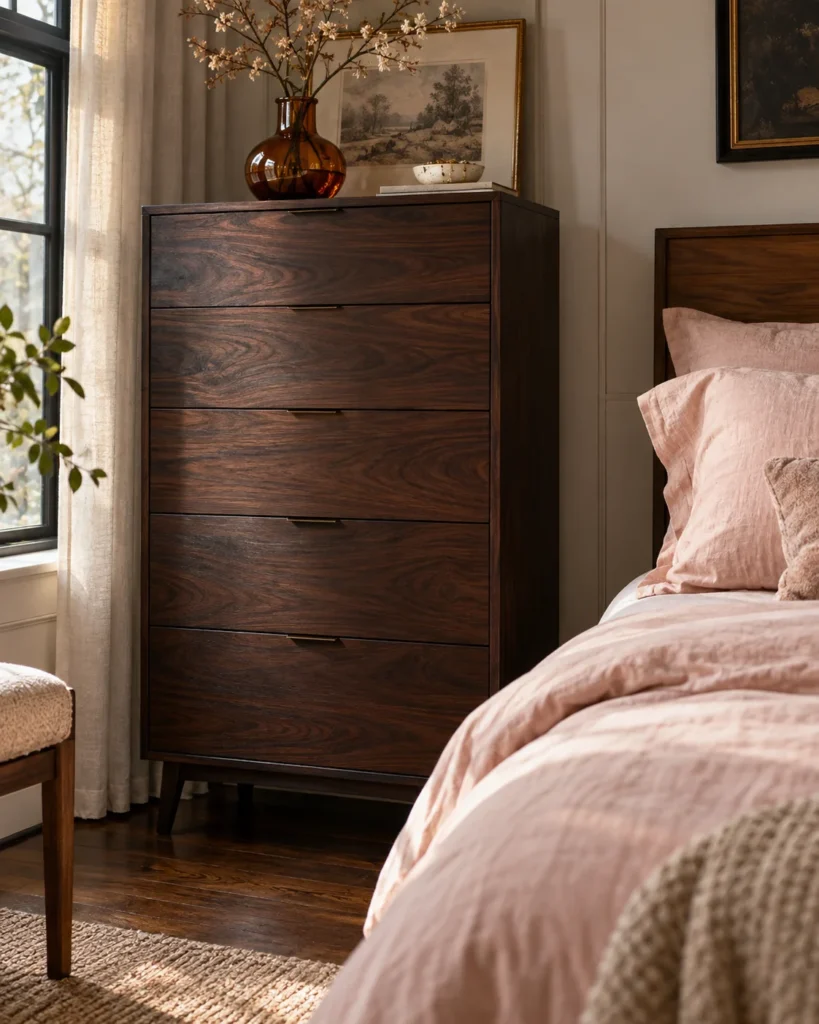
The Visual Vibe: Deep walnut furniture against powder blush walls feels rich, moody, and romantic.
The Design Counterbalance: Dark wood adds a strong, masculine weight that couples love.
The Real-World / Renter Hack: Thrifted mid-century walnut dressers are often affordable and built to last.
Pro tip for couples: Let’s be real, the easiest way to win over a hesitant partner is to let them pick the wood and metal finishes. Once walnut or black iron is in, earthy pink suddenly feels balanced.
16. Curved Ivory Boucle Bench at the Bed Foot
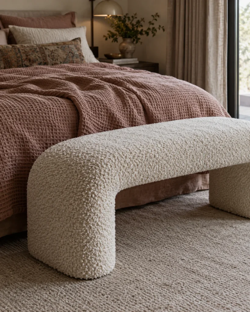
The Visual Vibe: A rounded ivory boucle bench adds a soft, sculptural touch.
The Design Counterbalance: Nubby texture gives flat walls something to play against.
The Real-World / Renter Hack: A boucle slipcover on an old bench costs much less than new upholstery.
17. Framed Sepia Architectural Sketch Gallery Wall
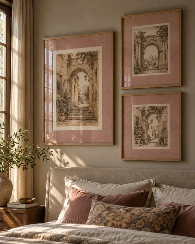
The Visual Vibe: Sepia sketches of old buildings, matted in dusty plaster tones, look collected and calm.
The Design Counterbalance: Architectural subjects feel intellectual and mature, never cutesy.
The Real-World / Renter Hack: Print free vintage sketches from public domain archives and frame them with thrifted frames.
18. Puddled Floor-to-Ceiling Sheer Blush Linen Drapes
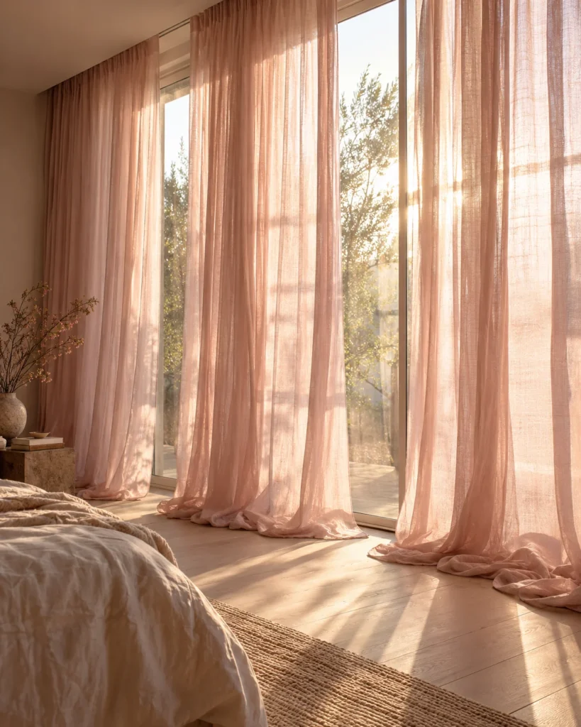
The Visual Vibe: Sheer blush linen pooling on the floor turns afternoon light into a soft natural filter.
The Design Counterbalance: Raw, loose weave keeps them relaxed instead of frilly.
The Real-World / Renter Hack: Mount the rod close to the ceiling so even a short window looks tall.
Room Orientation Reality Check for Your Earthy Pink Bedroom
The same paint can look completely different depending on which way your windows face. Check this before you buy a single gallon.
North-Facing Rooms
Cool, bluish light turns cool pinks into muddy gray.
Choose warm, peach-based clay to keep the room cozy.
South-Facing Rooms
Strong midday sun can wash soft pinks out completely.
Choose muted dusty rose with gray undertones, like Sherwin-Williams Redend Point.
Earthy Pink Bedroom FAQs
Not if you balance it. Add walnut wood, matte black metal, and linen bedding and the room feels warm and neutral for both of you.
What color bedding looks best against muted pink bedroom walls?
Oatmeal, ivory, sage, and soft rust all work beautifully. Avoid stark bright white, which can make the walls look pinker.
How do you make pink walls look modern rather than vintage shabby chic?
Skip ruffles and distressed white furniture. Use clean lines, natural wood, stone, and black or brass hardware.
What are the best matte finishes for clay and pink wall paints?
Flat, matte, or limewash finishes look most earthy. Use eggshell if you need something a bit easier to wipe clean.
Start Small and Let the Room Grow
Honestly, there’s no rulebook you have to follow here. Your bedroom should feel like an honest place to unwind, not a page from a catalog.
So try your earthy pink bedroom in small steps. Start with a washed linen duvet or a clay lamp, live with it for a few weeks, then decide on paint. You’ll know when it feels right.